GLM.ModelRefinement
Reading: Goldburd, M.; Khare, A.; Tevet, D.; and Guller, D., "Generalized Linear Models for Insurance Rating,", CAS Monograph #5, 2nd ed., Chapter 6.
Synopsis: This is core material for the modeling process. You'll learn how to decide if a variable is actually helping improve the predictive accuracy of the model via several statistical tests and summary plots. You'll also begin to learn how to compare different models to determine which is best and discuss tools for assessing the stability of a model.
Study Tips
This is a long reading with a lot of important definitions and some newer material. Tackle it in sections across several days. Focus first on knowing the definitions and procedures, then worry about understanding the output of those. Return to this material frequently throughout your studies so it doesn't get stale.
Historically this material hasn't been tested much. However, it is definitely fair game, so don't let your guard down due to the lack of past exam questions.
Estimated study time: 24 Hours (not including subsequent review time)
BattleTable
Based on past exams, the main things you need to know (in rough order of importance) are:
- Know how to compute the F-test for nested models as well as the AIC and BIC tests.
- Know the definitions of scaled and unscaled deviance plus key terms like the saturated and null models. Be able to describe them graphically.
- Know the properties residuals have when the model is a good fit and be able to interpret graphs of the residuals.
- Be able to apply working residuals and briefly describe the types of plots.
| Questions from the Fall 2019 exam are held out for practice purposes. (They are included in the CAS practice exam.) |
reference part (a) part (b) part (c) part (d) E (2018.Fall #6) Goodness of fit
- F-test, AIC & BICDeviance statistics
- explain useE (2016.Fall #6) Apply GLM
- GLM.BasicsGLM offsets
- GLM.BasicsModel Validation
- describe techniquesE (2016.Fall #7) Goodness of fit
- calculate AIC & BICTest statistics
- which is more reliable?Model selection
- make recommendation
| Full BattleQuiz | Excel Files | Forum |
You must be logged in or this will not work.
In Plain English!
Log-likelihood and deviance are the two most important measures for assessing how well a model fits the data.
A GLM estimates the mean response for each record in the data set. Since we specify the distribution (i.e. Gamma, inverse Gaussian, etc.) and can calculate the dispersion parameter, this means we know the full probability distribution assigned to a record. Hence, we can calculate the probability of observing the actual record. Then multiplying all of these probabilities together gives the probability of the data set occurring under the assumption that records are independent. This is known as the likelihood.
The GLM coefficients are selected to maximize the likelihood. Since this is typically a very small number, the individual probabilities are logged and then summed (which is the same as taking the log of the likelihood) to make the numbers more manageable to work with. This is called the log-likelihood.
The best GLM should assign coefficients to the set of parameters which have the highest likelihood of occurring. This makes sense because we know the historical outcomes have happened.
Two important types of model are the null model and saturated model. The null model only has an intercept. In this case the mean for each record is identical across all records as there are no predictors. The model predicts the mean of the data set as the response for each record.
The saturated model has the same number of predictors as the number of records in the data set. In this situation, the model perfectly predicts each record. This model is highly unlikely to be useful as it is overfitted to the data. There will very likely be large errors if this model is run on another data set such as the test data set.
The null model has the lowest log-likelihood and the saturated model has the highest.
Scaled deviance is defined as 2x the difference between the saturated log-likelihood and the model log-likelihood. Scaled deviance is denoted by [math]D^\star[/math], so we have [math]D^\star=2\cdot\left(ll_{saturated}-ll_{model}\right)=2\cdot\displaystyle\sum_i\left\{\ln(f(y_i\; |\; \mu_i=y_i))-\ln(f(y_i\;|\; \mu_i=\mu_i))\right\}[/math].
The summation is over all records in the data set. The first term in the summation is the saturated model; it assumes the true value of the mean for the record is in fact the value we observed, namely yi. It calculates the log probability of observing this under the distribution assumed for the GLM. This is the saturated model because we're correctly predicting each record by setting [math]\mu_i=y_i[/math].
The second term in the sum calculates the log probability of observing yi under the mean produced for the i th record by the fitted GLM. The difference between these terms is essentially a measure of by how much the model missed the recorded observation.
Note that f is the assumed distribution we're trying to fit (i.e. Gamma, inverse Gaussian, etc.). We're predicting the mean, and the dispersion parameter is assumed constant for all records and is estimated separately before calculating the scaled deviance. This means we know the variance of the model as well, so f is fully specified and can be used to calculate with.
The deviance for the saturated model is zero. The deviance for the null model is essentially the total deviance within the data set.
Unscaled deviance equals the estimated dispersion parameter multiplied by the scaled deviance. It's denoted by [math]D=\phi\cdot D^\star[/math]. Unscaled deviance is independent of the dispersion parameter. This makes it useful for comparing between models which have different estimates of the dispersion parameter.
Note: Maximizing the log-likelihood is the same as minimizing the (scaled or unscaled) deviance.
Important Points:
|
A nested model is a model which uses a subset of the set of predictors for a large model. For instance, an auto claim frequency model may include predictors like vehicle make, model, engine performance, miles driven, driver age, and driver years licensed. An example of a nested model would be the model that's built only on miles driven, driver age, and years licensed.
| Notation: Use a subscript S to denote the small (or subset) model. Use a subscript B for the bigger (larger) model. S is a nested model of B. |
We often try to measure how much predictive power we gain by adding more variables (or how much we lose by not including them). Remember, our goal is not to overfit the model to the data, so reducing the number of variables can be smart if you don't lose too much predictive power.
However, if you add more predictors, you'll always fit the model to the data better (in the extreme case you'll get a saturated model which fits perfectly). This means the (scaled or unscaled) deviance will always be lower when you add predictors to the model. So the right question to ask is: "Did the added predictors reduce the deviance significantly more than we would expect if they were not predictive?"
The F-statistic and F-distribution are one way of answering this question.
F-statistic and F-distribution
The F-statistic is [math]F=\frac{D_S-D_B}{( \# \mbox{ added parameters)}\cdot \hat{\phi}_B}[/math]. Here, [math]\hat{\phi}_B[/math] is the estimated dispersion parameter for the larger model. The denominator is the total expected drop in unscaled deviance because [math]\hat{\phi}_B[/math] is a good estimate for how much we expect the unscaled deviance to decrease due to random luck when we add a new parameter which is not predictive to the model. The numerator is the difference in unscaled deviance between the models and is always positive since adding parameters to a model decreases the unscaled deviance.
Important: Make sure you count the number of parameters carefully - it's not the same as the number of variables. If we add a continuous variable such as Age of Home, then this adds one parameter. However, if we add a categorical variable with five levels, then we're adding 4 parameters. Remember, the base level doesn't get counted because it's encoded in the design matrix entirely with zeros.
The expected value of the F-statistic is one because if the variables aren't predictive, then the difference in deviance should reduce by the number of parameters added times the dispersion parameter. Consequently, a value significantly larger than 1 indicates the bigger model is likely an improvement over the smaller model.
The F-statistic follows an F-distribution with the numerator having degrees of freedom equal to the number of added parameters. The denominator has [math]n-p_B[/math] degrees of freedom. Here, n is the number of records in the data set and pB is the number of parameters in the bigger model.
An F-distribution is associated with a significance level, [math]1-\alpha[/math], so each significance level has its own F-distribution table.
Let's look at an example found directly in the text (see p. 62).
Question: There are 972 rows of data in the data set. A GLM was built using 6 parameters. It has unscaled deviance [math]D=365.8[/math]. We add another predictor variable which is categorical with 5 levels. The resulting unscaled deviance is 352.1 and the estimated dispersion parameter is 1.42.
Calculate the F-statistic and its degrees of freedom.
- Solution:
- We have [math]D_S=365.8[/math], [math]D_B=352.1[/math], and [math]\hat{\phi}_B=1.42[/math]. Plugging these into the F-statistic formula gives [math]F=\frac{365.8-351.1}{4\cdot 1.42}=2.412[/math]. The numerator has 4 degrees of freedom because to get the larger model we added one variable with 5 levels so 4 parameters. The denominator has [math]972-(6+4)=962[/math] degrees of freedom. Going further, this F-distribution has a value of 2.412 at the 95.2 percentile. So if we're using a 95% or lower significance level, then the bigger model is a significant improvement.
So far we've discussed comparing nested models and the F-statistic only applies in this situation. But what about when the models aren't nested?
Deviance measures how well a model fits the training data (its goodness of fit). A penalized measure of fit also takes into account information about the complexity of the model. Two penalized measures of fit are AIC and BIC.
The Akaike Information Criterion (AIC) is given by [math] AIC = -2\cdot\mbox{log-likelihood}+2p[/math]. Here, p is the number of parameters in the model. A smaller AIC suggests a better model. The first term decreases as the model fit on the training data improves. The second term (penalty) increases as more model parameters are added. Models which produce small deviances but high AIC values should be discarded due to potentially overfitting from large amounts of model complexity.
Note the equation for AIC is very similar to the equation for scaled deviance. The AIC equation includes the penalty term and omits the 2 * log-likelihood of the saturated model. AIC may be considered a penalized measure of deviance when comparing two models.
The Bayesian Information Criterion (BIC) is given by [math]BIC = -2\cdot\mbox{log-likelihood}+p\cdot\log(n)[/math]. Here, p is the number of parameters in the model and n is the number of records in the training data set.
| Note: Insurance data sets tend to have a lot of records. So the BIC penalty is generally much greater than the AIC penalty. The authors of the GLM text claim that in their experience, relying too much on BIC may lead to predictive variables being excluded. They have found AIC to be more reasonable. |
mini BattleQuiz 1 You must be logged in or this will not work.
Residuals
Residuals are a way of assessing how well the models fits the data. A raw residual is simply the difference between the actual observed outcome and the predicted outcome, i.e. [math]y_i-\mu_i[/math]. Two more useful measures are the deviance residual and working residual.
Deviance Residuals
The deviance residual is defined for each record in the data set as follows:
- If [math]y_i-\mu_i\geq 0[/math] then [math]\sqrt{2\cdot\phi\cdot\left(\ln f(y_i \;|\; \mu_i=y_i) - \ln f(y_i \;|\; \mu_i=\mu_i)\right)}[/math]
- If [math]y_i-\mu_i\lt 0[/math] then [math]-\sqrt{2\cdot\phi\cdot\left(\ln f(y_i \;|\; \mu_i=y_i) - \ln f(y_i \;|\; \mu_i=\mu_i)\right)}[/math].
Recall that f is the probability distribution fitted by the GLM and notice the square of the deviance residual is the record's contribution to the unscaled deviance.
The deviance residual essentially adjusts the raw residual for the shape of the GLM distribution used. If the assumed distribution (i.e. gamma, inverse Gaussian, etc.) is correct, then the deviance residuals will be approximately normally distributed.
Properties of Deviance Residuals:
|
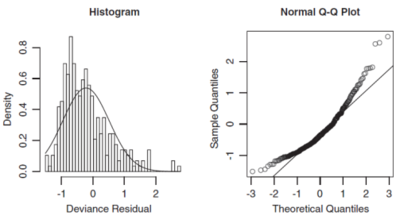
Two ways of assessing normality are histograms and q-q plots. A histogram of the deviance residuals should look approximately normal. Skewness indicates a different distribution should be used. For instance, if a Gamma distribution was assumed and the deviance residuals are right-skewed (tail to the right), then it may be better to use an inverse Gaussian distribution as this has more extreme skewness than a Gamma distribution. The histogram for a right-skewed distribution has its largest bars towards the left side of the x-axis (see the left hand graph in Figure 1 below).
A q-q plot has the theoretical quantiles on the x-axis and empirical quantiles on the y-axis. To make a q-q plot, sort the deviance residuals into ascending order, these are your y-coordinates. The corresponding x-coordinate is the standard normal inverse cumulative distribution function evaluated at [math]\frac{i-0.5}{n}[/math] where i is the residual index and n is the total number of residuals. An example of a q-q plot is shown in the right hand graph in Figure 1 below (source: GLM text).
Understanding Graphs of Deviance Residuals
If the deviance residuals are normally distributed then they will closely follow a straight line on the q-q plot. Where the points are significantly above the straight line, this indicates significantly more high-value deviance residuals than expected if they were normally distributed. This would then suggest the underlying choice of model should have reflected greater skewness.
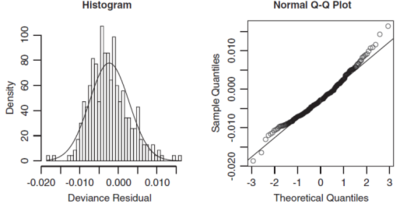
When both ends of the q-q plot lie above the straight line, i.e. more of a U-shape is formed, then the distribution is right skewed. So we should choose an error function that is more skewed to the right. The right hand graph of Figure 1 above shows an example of this where a Gamma distribution was fitted but instead an inverse Gaussian distribution would have been more appropriate as seen in Figure 2 below (source: GLM text).
Discrete distributions or mixed distributions like the Tweedie, which has a point mass at zero, will likely have deviance residuals which do not follow a normal distribution. This is due to the deviance residuals accounting for the shape of the distribution but not the density resulting from large numbers of records in the data set having the same target values. This causes the deviance residuals to be clustered into groups.
A solution (mentioned in name only in the text) is to use randomized quantile residuals. This method adds a random error to each discrete point with the aim of spreading them smoothly over the distribution.
Also, if the data underpinning each record is in fact highly aggregated, such as when the target variable is an average claim frequency across a large number of risks all of which have the same predictor variable values, then discretely distributed data ends up being smoothed out so deviance residuals are then more useful.
mini BattleQuiz 2 You must be logged in or this will not work.
Working Residuals
A problem can occur when using deviance residuals to analyze a large data set using graphical methods like scatterplots; the residuals can look like very dense "clouds" in the graph which makes it hard to identify any patterns within them.
A solution to this problem is to bin the residuals prior to graphing them. We do this by grouping residuals that have similar x-axis values and then plotting the average residual against the average x-value for each group of residuals. By doing so, the volume and skewness of the individual residuals is aggregated away, leaving the signal behind for analysis.
A particular type of residual called "working residuals" lend themselves to binning because they preserve the following properties of a good model. Namely, the working residuals are:
- Unbiased, so have no pattern in their mean,
- Homoscedastic, so have no pattern in their variance.
Alice: "Okay, these sound cool. How do I use with them?"
First, for each observation in the data set define the working residual by [math]wr_i=\left(y_i-\mu_i\right)\cdot g^\prime(\mu_i)[/math]. Remember, [math]y_i[/math] is the observed target variable value, [math]\mu_i[/math] is the predicted value of the target variable, and g is the link function.
Alice: "To save you time on the exam and reduce errors it's worth memorizing the following special cases"
|
Second, for each observation in the data set compute the working weight by [math]ww_i=\frac{\omega_i}{V(\mu_i)\cdot\left(g^\prime (\mu_i)\right)^2}[/math]. Here, [math]V(\mu_i)[/math] is the variance function and [math]\omega_i[/math] is the weight of the i th observation.
Alice: "If you need a refresher on these then click on the terms to go to the relevant section of GLM.Basics".
Table 1 below shows the working weight for several common models. Make sure you understand the calculation by deriving these and then assess if you want to memorize them or rely on quick calculation in the exam.
| Distribution | Link function | Working Weight Formula |
| Poisson | Log | [math]\omega_i\cdot\mu_i[/math] |
| Gamma | Log | [math]\omega_i[/math] |
| Tweedie | Log | [math]\omega_i\cdot\mu_i^{2-p}[/math] |
| Binomial | Logit | [math]\omega_i\cdot\mu_i\cdot (1-\mu_i)[/math] |
Now decide on the number of bins (100 is a common choice) and group the working residuals into the bins so that each bin has approximately the same sum of its working weights.
Lastly, for each bin calculate the binned working residual as [math]br_b=\displaystyle\frac{\sum_{i\in b} wr_i\cdot ww_i}{\sum_{i\in b} ww_i}[/math]. That is, we're computing the weighted average of the working residuals in the bin where the weights are the working weights. Notice a subscript b is used to emphasize the result is for a bin.
If you can find a clear pattern or "fanning out" when looking at plots of the working residuals then you have found a weakness in the model. The text gives the following three examples:
Plotting Residuals over the Linear Predictor
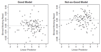
Recall the linear predictor is the right hand side of the GLM equation [math] g(\mu_i)=\beta_0+\beta_1 x_{i,1}+\ldots +\beta_p x_{i,p}[/math]. After determining the bins, plot the weighted average working residual on the y-axis (the binned working residual) and the weighted average linear predictor on the x-axis for each bin, where the weights are the working weights for the residuals within the bin. Figure 3 below shows this type of plot for two different GLMs.
The graph on the left in Figure 3 doesn't have a clear pattern, it's a seemingly random "cloud" which indicates the model is a good fit. However, the graph on the right has predominantly negative valued residuals in the left and right thirds of the x-axis and mostly positive residuals in the middle third. This suggests the model over predicts in the left and right thirds but under predicts in the middle third so the model may have missed a non-linear effect.
Alice: "The sign of the working residual tells you whether the model is under or over predicting. If it's positive then [math]y_i-\mu_i[/math] is positive which means the actual result, [math]y_i[/math] is higher than the prediction, [math]\mu_i[/math], so the model is underpredicting for that record. Conversely, if the working residual is negative the model is over predicting."
Plotting Residuals over the Value of a Predictor Variable
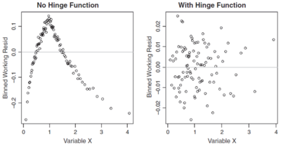
By plotting the residuals against each of the predictors in the model in turn you can sometimes find non-linear effects which may not have been properly accounted for. As above, bin the residuals first then plot the binned working residual on the y-axis and the weighted average predictor for the bin on the x-axis. Again, use the working weights to determine the weighted average. Figure 4 below shows an example of this.
The left hand graph in Figure 4 shows a clear cut break point which could be addressed with a hinge function for the predictor variable in question. After modifying the model to incorporate a suitable hinge function, the graph on the right is seemingly random which suggests the model improved.
Plots Residuals over the Weight
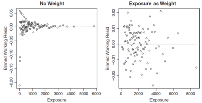
Some times you may have a choice of variables/information to use as the weights in a model (for instance claim counts or exposures). By plotting the binned working residuals against the weight variable used in the model (or a potential candidate for a weight variable) you can get information about the suitability of the model weights. A key feature of a good model is homoscedasticity which means there is no pattern in the variance. If we see a wider range of residuals in one part of the residual plot than another then homoscedasticity is violated. Figure 5 below shows an example of this.
In the left hand graph of Figure 5 above the records with low exposure have a greater range of residuals than those with higher exposures. This is intuitive if no weights were used in the model, i.e. [math]\omega_i=1[/math] for all records. The more exposures a record has, the lower its variance should be. After introducing exposures as the weight, the right hand graph of Figure 5 shows the model has greatly improved as residuals now have no noticeable pattern.
Assessing Model Stability
A sign of a good model is if it doesn't overreact to small changes to its inputs such as changing the result of one record in the data set. An example of where a bad model can be produced is if the data set contains a large loss in a class with few members (i.e. a few members share the same predictor characteristics as the large loss risk). Running the model with the large loss included may indicate a high risk class with a reasonable confidence interval. Re-running the model on the data excluding the large loss may indicate a low risk class instead, so the model isn't stable.
Cook's distance is a measure of how influential a data point is. If the model is re-run excluding some of the most influential data points and this changes some of the parameter estimates significantly, consideration should be given to reducing the weight assigned to those data points.
Cross validation can be used to look at the sensitivity of the parameter estimates by comparing the model estimates across various random mutually exclusive slices of the training data set. A stable model should produce similar parameter estimates across all of the slices.
Bootstrapping requires randomly sampling the training data set with replacement to create a new data set with the same number of records. The model is fitted on each bootstrapped data set and the parameter estimates are compared. Since we can bootstrap a large number of times, it is possible to calculate empirical statistics for the parameter estimates, such as the mean, variance, and confidence intervals.
mini BattleQuiz 3 You must be logged in or this will not work.
| Full BattleQuiz | Excel Files | Forum |
You must be logged in or this will not work.
