GLM.Validation
Reading: Goldburd, M.; Khare, A.; Tevet, D.; and Guller, D., "Generalized Linear Models for Insurance Rating,", CAS Monograph #5, 2nd ed., Chapter 7.
Synopsis: Here we learn how to compare models regardless of whether they were produced using a GLM. All we need is a set of (unseen) historical data and the ability to run it through each model. We'll look at various graphical ways to assess which model provides a better fit.
Study Tips
This is core content for the exam given the CAS has begun focusing more on modelling. Make sure you know how to interpret each type of graph and know the definitions really well.
Estimated study time: 8 Hours (not including subsequent review time)
BattleTable
Based on past exams, the main things you need to know (in rough order of importance) are:
- Confusion matrices - know the definitions and be able to calculate them given a scenario.
- Lorenz curve, Gini Index, and ROC curve - be able to work with them and describe what each means.
- Quantile Plots and Double Lift Charts - be able to read them to identify which model is stronger.
| Questions from the Fall 2019 exam are held out for practice purposes. (They are included in the CAS practice exam.) |
reference part (a) part (b) part (c) part (d) E (2017.Fall #5) Quintile Plots
- draw scenariosE (2017.Fall #6) Confusion matrices
- calculateROC & discrimination thresholds
- plotDiscrimination thresholds
- advantages & disadvantagesDiscrimination thresholds
- recommend an optionE (2016.Fall #5) Lorenz curve
- plotGini index
- describe
| Full BattleQuiz | Excel Files | Forum |
You must be logged in or this will not work.
In Plain English!
In this article we're considering how to choose between several models to land on the one you'll use in production. This requires a different set of techniques from those looking at ways to improve the fit of a single model because:
- Some models may be proprietary from a third-party vendor so you won't have the underlying data set nor detailed knowledge of the inner workings of the model.
- Business decisions often drive the final decision - even though one model may have slightly more lift, if it costs substantially more to lease from a third-party then management may not choose it.
It is important to be able to evaluate different models even when you don't have the underlying data set, or when the model was created using a process other than a GLM. This is done by using a database of historical observations which is combined with the prediction from each model for each observation. This is known as scoring. Scoring should always be done on a holdout data set to avoid overfitting.
Actual versus Fitted Plots
One way to compare models is by plotting the historical observation (the actual value of the target variable) on the y-axis and the predicted model output on the x-axis. If the model is good, the plot should look like a straight line. Three things to note are:
- This should be performed on a holdout (test) data set as otherwise overfitting may cause the plots to look really good.
- The size of the data set may require aggregation to produce a meaningful plot.
- Typically, the data is sorted according to the predicted target values, e.g. in order of increasing $ severity if predicting say claim severity.
- The data is then grouped into 100 groups so that each group has the same model weight (sum the weights associated with the records in the data set).
- Compute the average predicted value and average target value of the records in each group and plot.
- A log-scale is often helpful because a few large values can distort the pattern.
Measuring Lift
Lift is a relative concept; it only makes sense when comparing two or more models. To avoid overfitting, lift should always be evaluated using holdout data. Lift can refer to two things:
- Lift can mean the benefit that one model has over another. Or,
- Lift can mean how well a model distinguishes between the worst risk and the best risk.
With Quantile Plots
Suppose we have two models, called A and B, for pure premiums. We use the following steps to create a quantile plot for each model.
- Sort the predicted pure premiums in ascending order for each model.
- Group the data into quantiles (buckets)
- Often we use quintiles (5 buckets), deciles (10 buckets), or vigintiles (20 buckets).
- Each quantile/bucket should have approximately the same volume of exposures.
- Calculate the average predicted pure premium and average actual pure premium for each quantile.
- It can be helpful to normalize both the average predicted and average actual values by the average predicted loss cost on the data set.
- Plot the quantiles on the x-axis and actual values on the y-axis. Repeat, on the same graph, for the predicted values.
Note: When comparing models, it is sometimes necessary to rescale the predicted and actual values to a common scale by dividing by the average predicted model value.
Alice: "Here's an example of a quantiles plot question plus a practice problem."
Note: Nothing says the same quantile (e.g. quantile 2) has to contain the same data range for both models. However, it's implicit that if both models are good then the range of data in each quantile is probably pretty close.
Question: What are the three criteria for determining the best model?
- Solution:
- Predictive accuracy - are the predicted points "consistently close" to the actual observations?
- Monotonicity - through ordering the predicted pure premiums before grouping into quantiles, we've ensured the predicted pure premiums will always increase. The actual results should follow the same pattern, though minor reversals are acceptable.
- Vertical distance: This is the difference between the actual pure premiums for the first and last quantiles.
- The first quantile contains the lowest predicted pure premiums (the best risks). The last quantile contains the highest predicted pure premiums (the worst risks according to the model). The greater the vertical distance between the actual pure premiums for the first and last quantiles the more ability the model has to accurately segment the risks.
Question: What is a reversal?
- Solution:
- Consider the pure premium for insuring homes in the same location but with three different possible values, say $200k, $300k and $400k. If the expected pure premium for a $200k home is $200, is $150 for a $300k home, and is $350 for a $400k home, then we have a reversal. In other words, the drop in predicted pure premium doesn't make sense: the home coverage increased but the price dropped at first, and then increased further.
The above reversal example can also be re-phrased as follows. By ordering the expected (model) pure premiums, we have placed the $300k homes in a lower quantile than the $200k homes, which itself is in a lower quantile than the $400k homes (assuming at least 3 quantiles with sufficient separation). However, the actual pure premium observed for the $300k homes is likely higher on average than that of the $200k homes. Further, this is likely lower than the actual pure premium for $400k homes. So the graph of the actual values has a dip in the middle, which indicates a reversal.
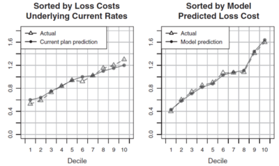
Figure 1 below is directly from the GLM text. It shows two quantile plots, each with 10 deciles, that are used to compare the performance of the current rating plan against the new model. Applying the three criteria above we deduce the new model has greater predictive accuracy because its model predictions track the actual values more closely than the current plan values do. Similarly, observe the current plan has a reversal in its 6 th decile whereas the new model has no reversals. Lastly, the vertical distance between the first and last decile is much greater for the new model than the current plan. Hence, under all three measures the new model outperforms the current plan.
Double Lift Charts
A double lift chart directly compares two models. Use the following process:
- For each record, calculate the sort ratio = [math]\frac{\mbox{Model A predicted loss cost}}{\mbox{Model B predicted loss cost}}[/math]
- Order the data set by sort ratio from smallest to largest
- Group the data set into quantiles
- Within each quantile, calculate:
- the average Model A predicted pure premium
- the average Model B predicted pure premium
- the average actual pure premium
- Normalize each of the above figures by dividing by their respective average across the entire data set.
- Plot the above three points for each quantile.
The first quantile contains the risks that Model A thinks are best relative to Model B. The last quantile contains risks that Model A thinks are worst compared to Model B.
The best model is the one which most closely matches the actual average pure premium in each quantile.
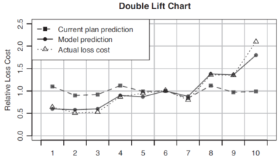
Figure 2 below is also from the GLM text. It shows a double lift chart which compares the current rating plan to a new model (though you can compare any two models). The new model is represented by the solid line and it tracks the actual data (dotted line) much more closely than the current model (dashed line) which suggests the new model is better than the current plan.
An alternative view of the double lift chart is plotting two curves, one for each of the model percentage error. Here, percentage error is defined as [math]\frac{\mbox{predicted pure premium for the model}}{\mbox{actual pure premium}}-1[/math] for each quantile. The model which has the flattest line is the one that best approximates the actual pure premiums.
Loss Ratio Charts
- Sort the data set according to the predicted loss ratio
- Group (bucket) the data into quantiles so each quantile has the same volume of exposures.
- Within each group, calculate the actual loss ratio and plot it.
To calculate an actual loss ratio we need to have a current model/rating plan in play so we can get the currently charged premium for each risk. If the current rating plan works well then it should match rate to risk so all quantiles should have the same loss ratio. However, if when we plot the actual loss ratio for each quantile, the chart consists of bars increasing from left to right, then the new model is outperforming the current model. The greater the vertical distance between the first and last quantiles the better the new model performs compared to the current model. This is because of the ordering of the quantiles; the new model charges higher premiums as you go to the right. If the actual loss ratios increase as you go to the right, then the proposed higher premiums will result in a lower loss ratio under the new plan which gets us closer to the goal of having a constant loss ratio across all risks (risk equity).
mini BattleQuiz 1 You must be logged in or this will not work.
The Gini Index
The Gini Index was originally devised to measure income inequality in nations. However, it can be adapted as follows for measuring lift in insurance models.
- Sort the test data set in order of increasing predicted pure premium (or increasing target variable). The lowest pure premiums are the records which the model is labelling as the best risks.
- Keep two separate columns, the first records the cumulative exposures in the data set for all previous records. The second records the cumulative losses for all previous records.
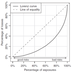
- Plot the percentage of cumulative exposures (out of the total data set exposures) on the x-axis. On the y-axis plot the percentage of cumulative losses (out of the total data set losses). This is known as the Lorenz curve.
- Compare the Lorenz curve against the 45 degree line.
- The Gini Index (or Gini coefficient) is twice the area between the 45 degree line and the Lorenz curve.
The 45 degree line is known as the line of equality because if using income or wealth instead of pure premiums, this says a 1% increase in exposure adds 1% of income/wealth. That is, income/wealth is distributed uniformly. In the case of pure premiums, this says losses are distributed uniformly.
The higher the Gini Index the better as this means the model is better at identifying the risks.
The Gini Index doesn't say if a rating plan will be adequate or profitable. Instead, it quantifies how well the rating plan segments between the best and the worst risks.
Figure 3 below shows the sample Lorenz curve given in the text.
Validation of Logistic Regression Models
Recall a logistic regression model produces an estimate of the probability that an event occurs. Quantile plots, Lorenz curves, and the Gini index can be computed in this situation by ordering the predicted probabilities in increasing order.
Another diagnostic tool for logistic models is the receiver operating characteristic (ROC) curve. This arises from the need to translate the probability of an event occurring into an action.
For instance, a logistic model might predict the probability of a heart attack given a set of observable medical inputs. We need to set a discrimination threshold for which probabilities over this deem the patient to be having a heart attack (so should intervene), and probabilities below this are likely not a heart attack (so no treatment for a heart attack).
Suppose the discrimination threshold is set at 50%. There are four scenarios that can occur.
- The model predicts a heart attack (that is, the model yields [math]\mu_i\gt 0.5[/math]), and the patient is having a heart attack. This is a true positive.
- The model predicts a heart attack but the patient is not having a heart attack. This is a false positive.
- The model does not predict a heart attack but the patient is having a heart attack, i.e. the model predicts [math]\mu_i\lt 0.5[/math]. This is a false negative.
- The model correctly predicts the patient is not having a heart attack. This is a true negative.
Outcomes 1 and 4 are successful for the model. Outcomes 2 and 3 are failures. Each type of failure has an associated cost such as missing the chance to save a life or unnecessary medical intervention.
A perfect logistic model would correctly predict either 0 or 1 for each outcome. In practice, the signal isn't perfect in our data as real-life involves false positives and false negatives. Consequently, the discriminant threshold choice results in a trade off between more false positives (and less false negatives) under a lower threshold, or more false negatives (and fewer false positives) when a higher threshold is used.
After building a logistic model, the test data set is run through the model to produce a set of probabilities which are then converted to binary outcomes (yes/no) via the discriminant threshold. These are compared against the known outcomes and group according to the four categories above. The results are shown as counts in a 2x2 matrix called the confusion matrix.
The confusion matrix has true and false positives in the first column, and true and false negatives in the second column. The true values lie on the leading diagonal. Each time you change the discriminant threshold you get a new confusion matrix.
Let's look at an example.
The ratio of True Positives to the number of Actual Positive Events (TP + FN) is called the sensitivity or true positive rate or hit rate.
The ratio of True Negatives to the number of Actual Negative Events (TN + FP) is called the specificity. One minus the specificity is called the false positive rate.
Here's another example and practice question.
| Alice: "Here's a way to memorize the definitions associated with the confusion matrix:" SeNsitivity = TP / (TP + FN) |
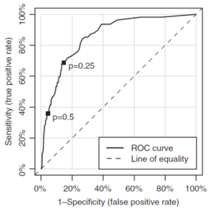
The receiver operating characteristic curve plots the false positive rate on the x-axis, and the true positive rate (sensitivity) on the y-axis for a range of discrimination thresholds between 0 and 1. We interpret the point (x,y) on the receiver operating characteristic curve as we can catch y% true positives (heart attacks) at the expense of x% false positives (predicting a heart attack when you're not having one).
A model with predictions that are essentially random will yield true and false positives in the same proportion regardless of the choice of discriminant threshold. So the curve follows a 45 degree line (the line of equality).
A model which has predictive power, that is, it performs better than selecting at random, has an ROC curve which is above the line equality. As the accuracy of the model improves, the ROC moves further away above the line of equality. The accuracy is quantified by calculating the area under the curve (AUROC).
Note: This is different to the Gini index for two reasons.
- The Gini index is measuring the area between the Lorenz curve and the line of equality, whereas here we are measuring the area under the ROC and ignoring the line of equality for this calculation.
- The Gini index requires multiplication by 2 and AUROC doesn't.
However, you can calculate one from the other.
A perfect model has an AUROC value of 1. A model that is no better than predicting a random has an AUROC of 0.5.
Figure 4 below shows an example of a ROC curve from the text. Pay attention to the direction the p values move — as the p-value shrinks the false positive rate increases and the sensitivity increases as well. That is, you'll get more true positives at the expense of picking up more false positives as the p value goes to 0.
mini BattleQuiz 2 You must be logged in or this will not work.
| Full BattleQuiz | Excel Files | Forum |
You must be logged in or this will not work.


